Introduction
In this module we will look at what steps we can take when the assumptions for the general linear model (lm) do not meet our requirements or cannot be satisfied by the data that we have.
This is a really common challenge that is faced by many students and researchers, who are often only taught statistics up to a certain point and then are faced with a problem that seems to expand further beyond. In the video below I summarise a lot of different scenarios to try to work out where to go next, when you see that your data does not fit into a conventional linear model, or the assumptions of those models seem to be invalidated, or that the questions you want to ask seem to be a little different:
We will not discuss all of those different options today. Instead we will focus on some of the most common alternatives, without going into a large amount of detail, and weighing up some of the pros and cons of these methods.
As I mention in the video, nearly all of the 'different' methods share a lot of the same common DNA and are essentially adding "one thing" to the general linear model. And there is a lot of commonality in the approach - we should focus on the interpretation of the model, and the assumptions needed for that model to be valid.
With the "generalised linear model" (glm), we change our assumption regarding the distribution of the residuals; and with the "linear mixed model" (lmm) we change our assumption regarding the independence of the observations. And these two modifications can be combined together which in turn forms a family of models called "generalised linear mixed models" (glmm).
We will also take a small exploration into alternative modelling frameworks that are substantially different from this. lm, glm, glmm are all examples of classic 'frequentist' statistical models - of the sort which have existed since the early 20th century. More recently two other modelling frameworks have become increasingly popular with evolution of computing power: 'machine learning' models and Bayesian models.
We will first consider under what circumstances these frameworks can be the most useful, and some of the key features which differentiate them from 'frequentist' methods.
Frequentist vs Bayesian vs Machine Learning
The choice between a linear model, a generalised linear model, or a generalised linear mixed model is one that can be made based on applying the standard 'frequentist' statistical techniques and logic to the context questions that you as an an analyst are trying to assess. But the distinction between when to use "Bayesian" or "Machine learning" models is more of a conceptual one, and often less of a clear cut choice.
There are extremely blurred lines between the choices of which paradigm should be chosen, but in very general terms a machine learning approach has the potential to provide the most accurate predictions; a Bayesian model has the potential to provide the strongest link between the model and the scientific theory; and a Frequentist model is somewhere in the middle but has the advantage of being more flexible and easier to interpret.
While there are many extremely passionate advocates for each of the approaches, who will strongly argue that each of the other approaches are irreparably flawed being "outdated", "black-boxes", "too subjective" or "un-interpretable", in reality there is a place for all of them. And it is extremely useful to be aware of some of the key characteristics and principles behind them.
Machine Learning Models - Clear use case: high volume of data; weak underlying knowledge & theory behind the relationship of the predictor(s) to the outcome(s); main objective of research: predictions
Bayesian Models - Clear use case: low volume of data; strong underlying knowledge & theory behind the relationship of the predictor(s) to the outcome(s); main objective of research: testing specific hypotheses
Frequentist Models - Clear use case: medium volume of data; some underlying knowledge & theory behind the relationship of the predictor(s) to the outcome(s); main objective of research: understanding relationship between predictors and outcomes
For this course we will mostly remain in the realm of "frequentist" statistics, (although with a small diversion into Machine Learning). But there are strong links between all of these different paradigms, and it is useful to be aware that there are more options if your work would be better suited to a machine learning or Bayesian scenario. Being able to understand the frequentist methods of glm and glmm will be required as an entry point to then learn how to adapt these further within a Bayesian context.
Data used in this session
We are going to continue on with the same data we were using in the previous module - concerning earthquakes near Fiji.
This is one of the Harvard PRIM-H project data sets. They in turn obtained it from Dr. John Woodhouse, Dept. of Geophysics, Harvard University.
And as a reminder, this was the point we reached towards the end of the previous module, fitting a straight line model onto the relationship between the magnitude of an earthquake and number of stations reporting an earthquake:
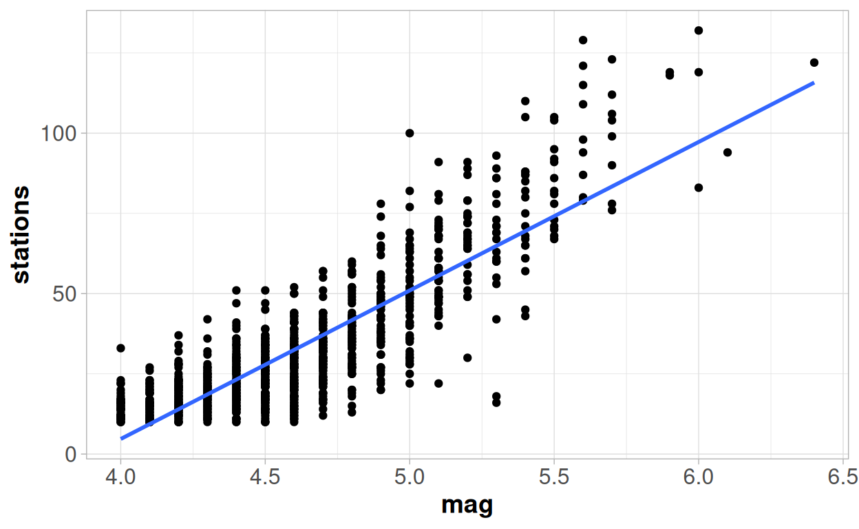
But we were a little unsatisfied with that model - so let's see what we can do about that!
Generalised Linear Models
With the model we fitted in the previous module we had questions in regards to the linearity of the trend between the two variables in our model - magnitude of earthquake as the predictor variable and number of stations reporting, as the response variable. And we were also concerned about the homogeneity of the variance around the trend - as the magnitude of the earthquake increased so did the variability in the number of stations reporting.
But we perhaps should not have been surprised as our outcome variable, stations, is a "count" or "integer" variable, and not a true continuous numeric variable, which could take any value.
The Poisson Distribution
There are certain known properties about the distribution of integers vs. the distribution of truly continuous variables. The three most important distinct properties being that:
- Integer variables must always be greater than or equal to zero
- There may be a restricted number of unique outcomes, rather than all observations being unique
- The variation in the outcome increases as the outcome itself increases - i.e. you would expect a long upper tail.
These properties are combined together into derivation of the Poisson distribution.
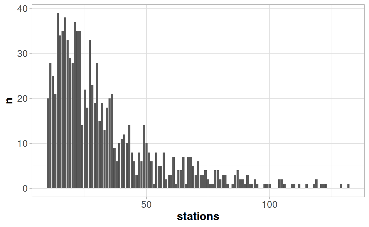
And all of these properties can be seen in the distribution above:
Number of stations is always positive, by definition. Although the theoretical minimum number of stations in this case would actually be 1 rather than 0; since an earthquake reported by no stations would not appear in the data.
We have 1000 earthquakes in our data, but there are only 102 unique outcome values for station; some of which are repeated almost 40 times. With a truly continuous variable we would expect to see 1000 different unique values, if we were able to record the outcomes with a sufficient level of precision.
There is a high density of observations at low values, and then a long upper tail - indicating the variability is increasing as the value increases
A Normal distribution always has exactly the same shape - a symmetrical "bell-shaped" curve. The mean value, and the standard deviation will change, but the shape will always be the same. However the same is not true for the shape of a Poisson distribution - which is dependent on the mean value of the distribution. If the mean value is "large" then the shape of a Poisson distribution is almost indistinguishable from a Normal distribution. If the mean value is close to zero then the shape of a Poisson value looks very different!
You can experiment with the tool below to see how the shape of a simulated Poisson distribution with 1000 observations varies with the mean of the distribution:
In general where the mean of an integer is greater than 20, then an integer variable will be fairly well approximated by a Normal distribution, and when it is reaches than 40 then the two distributions should be almost indistinguishable.
Within a generalised linear model we leave the normal distribution behind, and instead look to produce a model with the help of a different distribution - and the Poisson distribution is an obvious choice when we have an integer response variable. When thinking about general linear models, we consider the distribution of the residuals from the model. However when thinking about generalised linear models we think about the conditional distribution of the outcome y for a given set of x variables.
Our average number of stations is 33, so we are in the region where a normal distribution may be a reasonable approximation for a poisson distribution.
And so at the lower end of the range, where the linear model currently under-predicts the response and over-estimates the variability then using a Poisson distribution would help us improve the model quality. A Poisson model would never make any predictions of less than zero, and the distribution would expect that the lower fitted values would have lower variability. So it seems like an intuitive choice to explore further.
Let's go back to our scatter plot and fit a line using a Poisson regression side by side to a line fitted through linear regression. The green line comes from a Poisson regression model, the blue line from a linear regression model and the red circles on the plot represent the mean value of the observations for each unique value of magnitude.
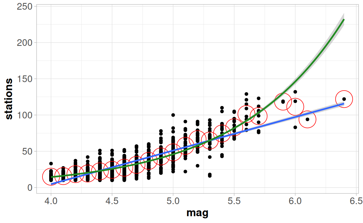
The Poisson model very clearly provides a better fit at the lowest values. The blue line consistently under-estimates the number of stations where the magnitude is less than 4.4, the green line seems to go straight through the middle of them. We would expect this - as with a Poisson regression we are constrained to know that our outcome variable must be greater than 0; whilst our linear regression will continue through zero and start predicting negative values.
The Poisson model continues to perform better in the range of magnitude 4.5-5.5, but we can see that here the linear regression model now over-estimates the results. Although the difference between the two models in this range is very minimal.
But then we see a bigger deviation at higher values. Between 5.4-5.9 on the x axis, the Poisson distribution again seems to be performing better this time as a result of the linear regression model under-estimating the outcome. But the quality of the model seems to go completely off the rails at the highest end of the model.
The Poisson distribution expects that the number of stations to keep increasing by an increasingly large amount as the magnitude increases; but here it is now the linear regression model that is actually doing a much better job of capturing those extreme points, as the trend does not follow the pattern expected by the Poisson model.
So overall, for the majority of data, the Poisson regression looks a slightly better option; but then for the highest values the Poisson looks like considerably worse option! We will come back to why that might be in the next section, but see if you can think of an intuitive answer before then.
Fitting the model
Although we are still perhaps a little unsatisfied by this model - let's take a quick look at the formula underlying this model, how the outputs from fitting a model in this way would look, and how the coefficients and interpretations from this model would differ from a general linear model.
Remember that the formula for the general linear model was:
y = βX + \(\epsilon\) ~ N(0, \(\sigma^2\) )
For a generalised linear model this changes a little bit to:
g(y) = βX
Where we may have a "link function" g() of our response variable. Instead of an assumption around the distribution of the residuals, we now make our distributional assumption around the y variable itself.
The "residual error term" disappears from the general formula, as our assumptions about the distribution in a generalised linear model are now about the y variable itself rather than the residuals. Instead we consider the conditional distribution of y for a given set of x values. We denote this conditional value of y as y|X.
As we saw in the simulations above, the Poisson distribution looks very different when the mean is close to zero, compared to when the mean is larger. So we do not consider the residuals as a whole to come from the same distribution, as we do with the general linear model, because we expect to see lower variability at low levels of y and higher variability at high levels of y.
When dealing with a Poisson process we assume that our Y variable comes from a Poisson distribution, and our "link" function is a log transformation.
log(y) = β0 + β1x
y|x ~ Poisson(y|x)
One key aspect of the Poisson distribution is that it takes the same value of the mean as it does for the variance. This is an assumption we will need to check later.
Model Output
##
## Call:
## glm(formula = stations ~ mag, family = "poisson", data = quakes)
##
## Coefficients:
##             Estimate Std. Error z value Pr(>|z|)
## (Intercept) -1.96624    0.05584  -35.22   <2e-16 ***
## mag          1.15849    0.01147  101.01   <2e-16 ***
## ---
## Signif. codes:  0 '***' 0.001 '**' 0.01 '*' 0.05 '.' 0.1 ' ' 1
##
## (Dispersion parameter for poisson family taken to be 1)
##
##     Null deviance: 12198  on 999  degrees of freedom
## Residual deviance:  3018  on 998  degrees of freedom
## AIC: 8198.1
##
## Number of Fisher Scoring iterations: 4
When looking at the coefficients of this model we need to be careful to interpret them on the log scale.
So: if there was an earthquake with zero magnitude the intercept term, indicating the expected value of the logarithm of the number of stations is -1.966.
To directly make an interpretation we need to back-transform this value using an exponential transformation:
exp(-1.96624)## [1] 0.1399822So the expected number of stations reporting an earthquake of 0 magnitude is 0.14.
This is a lot more sensible than the intercept from linear regression model, which showed an expected number of stations of -180.
It is similar when thinking about the slope - a one unit increase in magnitude of earthquake is associated with an increase on the log scale of 1.15 stations. So when we back-transform this number onto the original scale it no longer refers to the number of additional stations reporting the earthquake, but the proportional increase in the number of stations.
## [1] 3.18512For a one unit increase in the magnitude we expect to see 3.2 times as many stations report that earthquake. The predicted number of earthquakes reporting the quake, will depend on where we are on the scale:
The table below shows predictions from the model for 4 different earthquake magnitudes, although the bottom and the top levels of magnitude do require us to extrapolate outside the range a little.
| mag | Prediction | One Unit Change | Proportional One Unit Change | Log Prediction | One Unit Change (Log Scale) |
|---|---|---|---|---|---|
| 3.5 | 8.1 | NA | NA | 2.09 | NA |
| 4.5 | 25.7 | 17.6 | 3.2 | 3.25 | 1.16 |
| 5.5 | 81.9 | 56.2 | 3.2 | 4.41 | 1.16 |
| 6.5 | 260.8 | 178.9 | 3.2 | 5.56 | 1.16 |
The difference in the predicted value for a 3.5 magnitude earthquake (8 stations) and a 4.5 magnitude earthquake (26 stations) is 18. Then the difference between a 4.5 magnitude earthquake and a 5.5 magnitude earthquake is an increase of 56. But on both of those one unit jumps the predicted number of earthquakes has increased by 3.19 times.
It is now easy to see, at least mathematically, why the fitted curve starts to go up so quickly at the higher observed values because of this feature of the Poisson Model.
Model Fit
If we wanted to try to compare the "goodness of fit" between this model, and the general linear model then we need to be careful about which methods we choose to employ.
Many model comparison methods are not valid for comparing across different models fitted using different distributions - e.g. we cannot compute any sort of p-value, or directly compare AIC/BIC values.
But what we can consider is something which may compare the predictive quality of the models. An R-squared value for example, although other alternatives exist.
When dealing with generalised linear models we tend to refer to a "pseudo-R squared" value. This is because the link to Pearson's "r" correlation coefficient no longer applies - hence the use of the word "pseudo" as we are not strictly thinking of "r" squared any more. But we can still consider this as the percentage of variability that is explained by the model:
## [1] 0.7525941So the Poisson model provides a pseudo R-squared of 75.2%, compared to what we saw previously with the linear regression model showing a 72.5% R-squared value. So it is improved, because of the better fit for the majority of the data.
But when considering fundamentally different models, we also would want to consider intuitively which makes more sense, as well as making solely data-driven decisions. The way in which the curve strongly deviates from the trends at the higher level here at the upper levels would probably make us question whether we should prefer this new model, despite it being a better fit.
Assumptions
We can also need to consider the validity of the assumptions - many of these are assessed in exactly the same way as we would assess the linear model. The assumptions regarding high leverage values & unexplained curvature in the trends are identical.
Dispersion
There is one major "new" assumption to check - which we can assess from the very first output we saw from the model. This is based on the "deviance" and the "dispersion parameter":
##
## Call:
## glm(formula = stations ~ mag, family = "poisson", data = quakes)
##
## Coefficients:
##             Estimate Std. Error z value Pr(>|z|)
## (Intercept) -1.96624    0.05584  -35.22   <2e-16 ***
## mag          1.15849    0.01147  101.01   <2e-16 ***
## ---
## Signif. codes:  0 '***' 0.001 '**' 0.01 '*' 0.05 '.' 0.1 ' ' 1
##
## (Dispersion parameter for poisson family taken to be 1)
##
##     Null deviance: 12198  on 999  degrees of freedom
## Residual deviance:  3018  on 998  degrees of freedom
## AIC: 8198.1
##
## Number of Fisher Scoring iterations: 4
The assumption made is that the "Dispersion parameter for poisson family taken to be 1". This is an assumption we have already mentioned: that the mean value and the variance value are the same, as is the case for the Poisson distribution.
But in reality this is frequently not the case - we can have "over"-dispersion or "under"-dispersion. This is where the amount of variability, or dispersion, away from the trend is either higher or lower than expected. Generally this will only have a major impact upon the standard errors/hypothesis tests and not onto the parameters themselves.
But it is a relatively easy assumption to identify:
The residual deviance value should be approximately equal to the number of degrees of freedom. If we see in the output that the "residual deviance" value and the number of degrees of freedom are very different to each other, then the assumption has not held. If the deviance value is more than 1.5 times the number of degrees of freedom we have "Over-dispersion"; if the number of degrees of freedom is more than 1.5 times the residual deviance we have under-dispersion.
Over-dispersion is relatively common, and not an unexpected result for many instances - but it is an important point to recognise and adjust for where hypothesis tests are being used around the model otherwise the p-values will be consistently under-estimated, and trends may falsely be concluded to be significant.
If we see the assumption not to hold - as in this instance where the ratio between these two numbers is 3.0 (3018 / 998); then we have a few different choices:
One of the reasons why we may have more variability than we expect is because the number of stations will be impacted by more than just the magnitude of the earthquake, other factors are important. So one solution to this problem is to extend the model to include additional relevant variables, which will help to explain this excess variation.
An alternative would be to tell the model to explicitly estimate a dispersion parameter, which is not equal to 1, to adjust the variance by a certain factor, to account for this:
##
## Call:
## glm(formula = stations ~ mag, family = "quasipoisson", data = quakes)
##
## Coefficients:
##             Estimate Std. Error t value Pr(>|t|)
## (Intercept) -1.96624    0.09679  -20.31   <2e-16 ***
## mag          1.15849    0.01988   58.27   <2e-16 ***
## ---
## Signif. codes:  0 '***' 0.001 '**' 0.01 '*' 0.05 '.' 0.1 ' ' 1
##
## (Dispersion parameter for quasipoisson family taken to be 3.005132)
##
##     Null deviance: 12198  on 999  degrees of freedom
## Residual deviance:  3018  on 998  degrees of freedom
## AIC: NA
##
## Number of Fisher Scoring iterations: 4
When you compare to the previous outputs, you will see an increase in the standard errors for the coefficients, but no changes to the coefficients themselves. This adjustment only effects our variance term, and not the overall trends from the model.
This adjustment can work for 'moderate' cases of under or over-dispersion, but in cases of serious overdispersion then this may bias the estimates as well as the variance. So in those cases, rather than only modifying the dispersion parameter, we may want to choose a completely different distributional "family" altogether. The usual choice for over-dispersion would the "negative binomial" distribution. This will account for dispersion, and may have an impact on the model itself - but comes at the trade-off of increasing the model complexity.
Under-dispersion is often associated with a lack of independence between observations - and adding in extra variables is likely to make this worse rather than better! Again we could correct it through adjustment of the dispersion parameter which will decrease the value of the standard errors. But if this is the result of our observations being dependent on each other then this is extremely dangerous - we will be 'over-correcting' for the issue and are extremely likely to provide "false positive" significant results when considering the hypothesis tests. The most likely cause of this, the lack of independence, should be accounted for explicitly - potentially through a mixed model.
Linearity?
The right hand side of our formula for the GLM looks exactly the same as the right hand side of our formula from a linear model:
β0 + β1x
Nothing has changed about this formula - it is still an equation denoting a straight line. Therefore linearity is still an important concept for the relationship between our variables and we still need to consider if a straight-line is a coherent explanation for the trend we are modelling.
The difference is that we are now looking at a straight line in relation to the link function of y. Within the Poisson regression model this is the log of y. So we can assess this by plotting the number of stations on a log axis and then looking to see if the trend seems broadly linear:
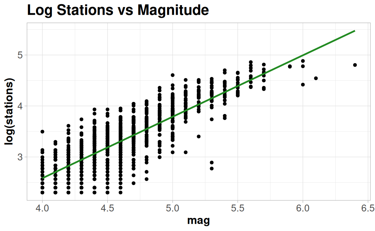
This plot matches what we saw earlier - a straight line looks plausible at lower and mid-range values on the log scale, but consistently overestimates the highest values.
Other assumptions
When looking at the quality of the model, like with the linear regression model, it can also be useful to interrogate different plots of the residuals. The sets of assumptions we are assessing, and how we define the residuals, will vary according to which family we are using in our generalised linear model. We won't dive into the details within this course, but you can find more information here: https://rpubs.com/benhorvath/glm_diagnostics
So what is the problem here?
A Poisson model intuitively seems like should make sense here - the number of stations is a 'count' variable, and we see lower variability at lower levels. And the model fits well for the bulk of our earthquakes - but only up until a certain point when the model strongly deviates away. Why would this be?
If we go back to one of the very first plots we made of this data set we looked at trying to fit a smoothed curve onto the trend and what we saw was something that looked like a very clear "S" shape.
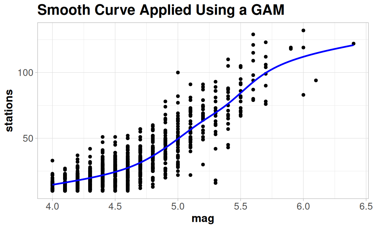
So why might be the reason why see a trend start to flatten out rather than keep increasing?
Because, as well as a lower limit of 1, there is also an upper limit to the number of different stations from which we obtained this data from. And the largest earthquakes will be reported by all, or nearly all of the stations.
So this calls for a different sort of generalised linear model - a logistic model.
Binomial Logistic Model
The standard linear regression model assumes that there is no theoretical limits on the range of values the outcome could take - it runs from negative infinity to positive infinity. The Poisson model will always have a fixed lower limit, zero, for our outcome. But it has no upper limit, and indeed because of the link function it will trend towards positive infinity faster than a straight line.
So what we need is a logistic model - one which will take an S shape and will have both an upper and a lower limit.
There are a few different types of logistic model - but the most commonly used is a "Binomial logistic" model - where the lower and upper limits are known and set to equal 0 and 1 respectively. This is another different example of a generalised linear model, this time created with the "Binomial" distribution.
It looks like that is not the case here without example, as our number of stations certainly appears to be an integer variable, rather than one bounded by 0 and 1. But let's change the way we think about it - instead of thinking about each earthquake, let's think about each station. Any time there is an earthquake each station either does or does not report, i.e. a binary outcome. And a Binomial distribution is a series of binary outcomes in which we consider the proportion of how many "successes" there were from a total number of "events". So rather than thinking about "n stations" reporting an earthquake, we instead need to think about this as "x% of the stations" reporting.
A problem we have with this particular dataset we do not know exactly what the "total number of stations" is, and there is a good chance that it may not always be the same over time. For the sake of keeping the example a little more straightforward I will declare that there are, and there always were, 145 stations within our region around Fiji (a number I came to somewhat arbitrarily from taking the maximum value, 132, and adding 10% to it).
In terms of the R output, everything will look extremely similar to what we saw from the Poisson output, but there is one big difference that is not clear at all from the output.
For a the Binomial logistic generalised linear model the formula changes to: logit(y) = β0 + β1x
Where: logit(y) = log(y/(1-y))
y|x ~ Binomial(y|x)
And we assume that y is a binomial outcome. A binomial outcome represents the probability, or percentage/proportion, of events which will be a "success". So it does not only have possible values 0 and 1 - it takes any value between 0 and 1, to represent the proportion of events we would expect to be successes for a given x value.
The logit transformation, is also known as the "logistic" or "log odds" function. When interpreting this formula, and the output of the model directly, we consider the change in the "log odds" of each station reporting the earthquake associated with the change in the magnitude.
The odds can be interpreted as the ratio between the proportion of 'successes' (p) divided by the proportion of 'failures' (1-p).
In gambling this concept of odds is used very frequently where an event may be described as having odds of "3 to 1". This statement is equivalent to a value for the odds of 1/3 - for every "1" success there would be "3" failures; or an inferred probability of the event of "1 in 4" or 0.25.
##
## Call:
## glm(formula = cbind(stations, 145 - stations) ~ mag, family = "binomial",
##     data = quakes)
##
## Coefficients:
##             Estimate Std. Error z value Pr(>|z|)
## (Intercept) -9.49364    0.07734  -122.7   <2e-16 ***
## mag          1.76775    0.01625   108.8   <2e-16 ***
## ---
## Signif. codes:  0 '***' 0.001 '**' 0.01 '*' 0.05 '.' 0.1 ' ' 1
##
## (Dispersion parameter for binomial family taken to be 1)
##
##     Null deviance: 17225.9  on 999  degrees of freedom
## Residual deviance:  4183.1  on 998  degrees of freedom
## AIC: 9073.4
##
## Number of Fisher Scoring iterations: 4
So when we are thinking about the "slope" parameter we are thinking about the "change in the log odds" for a one unit change in the x variable.
Looking at the output above:
As the magnitude increases by 1 unit we expect an increase in the log odds of any station reporting it to increase by 1.77. For an earthquake of 0 magnitude we expect the log odds of any station reporting it to be -9.49.
Thinking in terms of log odds is kind of a confusing, and not very intuitive concept!
But like with the Poisson model, taking the exponential of this value starts to make things more useful. In this case, we move to an "Odds Ratio" associated with a one unit change in x. That is how many times larger the odds of an event y are where x=1 compared to the odds of an event are where x=0.
exp(1.76775)## [1] 5.857659Taking the exponential value of the slope coefficient tells us that the Odds of a station reporting an earthquake will increase by 5.85 with a one unit increase in the magnitude; an Odds Ratio of 5.85.
If the coefficient in the model is equal to 0, then the odds of two events are the same and the odds ratio is equal to 1; i.e. there is no effect of x on the likelihood of y. If the coefficient is negative then the Odds Ratio will be less than 1 and the likelihood of y decreases as x increases. If the coefficient is positive then the Odds Ratio will be more than 1 and the likelihood of y increases as x increases.
The hypothesis tests around these parameters can be interpreted as testing the null hypothesis of the "log odds" being equal to 0; equivalent to saying that the "Odds Ratio" will be 1 or that there is no relationship between x and y.
##
## Call:
## glm(formula = cbind(stations, 145 - stations) ~ mag, family = "binomial",
##     data = quakes)
##
## Coefficients:
##             Estimate Std. Error z value Pr(>|z|)
## (Intercept) -9.49364    0.07734  -122.7   <2e-16 ***
## mag          1.76775    0.01625   108.8   <2e-16 ***
## ---
## Signif. codes:  0 '***' 0.001 '**' 0.01 '*' 0.05 '.' 0.1 ' ' 1
##
## (Dispersion parameter for binomial family taken to be 1)
##
##     Null deviance: 17225.9  on 999  degrees of freedom
## Residual deviance:  4183.1  on 998  degrees of freedom
## AIC: 9073.4
##
## Number of Fisher Scoring iterations: 4
We can go back to the intercept term as well - the exponential of this term gives us the Odds of a station reporting when magnitude is equal to zero.
exp(-9.49364)## [1] 7.53294e-05The formula for the Odds is calculated as p/(1-p). If we rearrange this formula we can use this value of the Odds to provide us with the probability of a station reporting the earthquake of 0 magnitude.
Odds = p/(1-p) p = Odds/(1+Odds)
exp(-9.49364)/(1+exp(-9.49364))## [1] 7.532373e-05Which is, as expected, an extremely low number! But the same formula is more useful for making predictions at informative levels of x. Let's say an earthquake with a magnitude of 5:
log(Odds) = -9.49 + 1.77 * 5 = -0.64
Odds = exp(-0.64) = 0.53
Probability = 0.53/(1+0.53) = 0.34
Of course the computer software of your choice will actually do all of the calculations for you, but it is useful to see the link between the model and the outcome you may be interested in.
Where thinking of a pure binary outcome variable (either "0" or "1") then we can consider the predictions as probabilities of the outcome being "1". In this case where we are thinking about a Binomial outcome (Number of "successes" out of a certain number of "events") then we can consider the predictions as the proportion of the events we expect be "successes".
| mag | Predicted Proportion | Odds | One Unit Change in Proportion | Odds Ratio | Log Odds Ratio |
|---|---|---|---|---|---|
| 3.50 | 0.04 | 0.04 | NA | NA | NA |
| 4.50 | 0.18 | 0.21 | 0.14 | 5.86 | 1.77 |
| 5.50 | 0.56 | 1.26 | 0.38 | 5.86 | 1.77 |
| 6.50 | 0.88 | 7.37 | 0.32 | 5.86 | 1.77 |
As with the Poisson model, we can estimate a Pseudo R-squared value:
## [1] 0.7571607Which shows that we have increased the percentage of the variability we were able to explain. The increase is only relatively small since for the vast majority of the points the models look extremely similar - it is only the the flattening off of the curve at the extreme end where there is a difference, and this is being driven by a small number of extreme earthquakes.
But although the quality of the model has only been improved marginally in terms of the fit on the data, it does make a considerable amount more intuitive sense to the context of the relationship. This is always an extremely important point to consider, particularly in scientific research where you will need to justify the choices in your modelling in how they capture or update upon known scientific theory.
Much of data analysis is increasingly moving towards models that may make purely data-driven conclusions and have "internal validation", without considering the links between the model to known real-world conditions, "external validation".
Assumptions & Model Checking
The way in which we would assess a logistic regression model is very similar to the Poisson model. Although with each different family of distributions, comes a slightly different set of assumptions:
You can read more about these here, specific to the logistic regression model: https://pmc.ncbi.nlm.nih.gov/articles/PMC4885900/
You may have noticed in the earlier output that the same assumption about deviance is again violated by the model here; as with the Poisson model we see evidence of over-dispersion.
##
## Call:
## glm(formula = cbind(stations, 145 - stations) ~ mag, family = "binomial",
##     data = quakes)
##
## Coefficients:
##             Estimate Std. Error z value Pr(>|z|)
## (Intercept) -9.49364    0.07734  -122.7   <2e-16 ***
## mag          1.76775    0.01625   108.8   <2e-16 ***
## ---
## Signif. codes:  0 '***' 0.001 '**' 0.01 '*' 0.05 '.' 0.1 ' ' 1
##
## (Dispersion parameter for binomial family taken to be 1)
##
##     Null deviance: 17225.9  on 999  degrees of freedom
## Residual deviance:  4183.1  on 998  degrees of freedom
## AIC: 9073.4
##
## Number of Fisher Scoring iterations: 4
The same set of choices is then out there for us to make - either to adjust the modelling approach if we think this is a major issue, or to adjust the dispersion parameter away from 1, which will change the error terms but not change the coefficients themselves.
##
## Call:
## glm(formula = cbind(stations, 145 - stations) ~ mag, family = "quasibinomial",
##     data = quakes)
##
## Coefficients:
##             Estimate Std. Error t value Pr(>|t|)
## (Intercept) -9.49364    0.15721  -60.39   <2e-16 ***
## mag          1.76775    0.03303   53.52   <2e-16 ***
## ---
## Signif. codes:  0 '***' 0.001 '**' 0.01 '*' 0.05 '.' 0.1 ' ' 1
##
## (Dispersion parameter for quasibinomial family taken to be 4.131731)
##
##     Null deviance: 17225.9  on 999  degrees of freedom
## Residual deviance:  4183.1  on 998  degrees of freedom
## AIC: NA
##
## Number of Fisher Scoring iterations: 4
And the same question exists about linearity that we discussed with the Poisson regression model. But this time the link function is different: we need to assess the linearity of the trend on the log odds scale.
And the linearity here does look reasonable.
But we still have had to make a big assumption in the modelling process here - that the number of stations has a "ceiling" of 145. So let's consider one final alternative method - one which will require us to make no assumptions about our data, and not need to worry about whether the data fits into certain distributions or how to interpret the link functions.
A simple machine learning example
So far we have dealt solely with parametric ways of dealing with a statistical model. But these come with a high burden of assumptions, and perhaps force the model into an "equation" where this may not be the most appropriate way to deal with the prediction of outcomes.
"Machine learning" models cover a wide range of different techniques, but in general terms these models look to isolate specific patterns present within the data, and then combine together all of these patterns into a predictive model.
The simplest form of a machine learning model would be a "classification and regression tree".
This is a bit like a flow chart - the model starts with the whole dataset and then creates a rule to split the data into two sub-groups based on one of the x variables. The rule it creates will look to provide the two most distinct groups possible in terms of the average values of the y values.
Then it will look to split each of those two sub-groups into two more sub-groups, and so on. This will continue until it cannot find a difference larger than a pre-specified threshold or until the number of points in one of the groups is below a certain threshold.
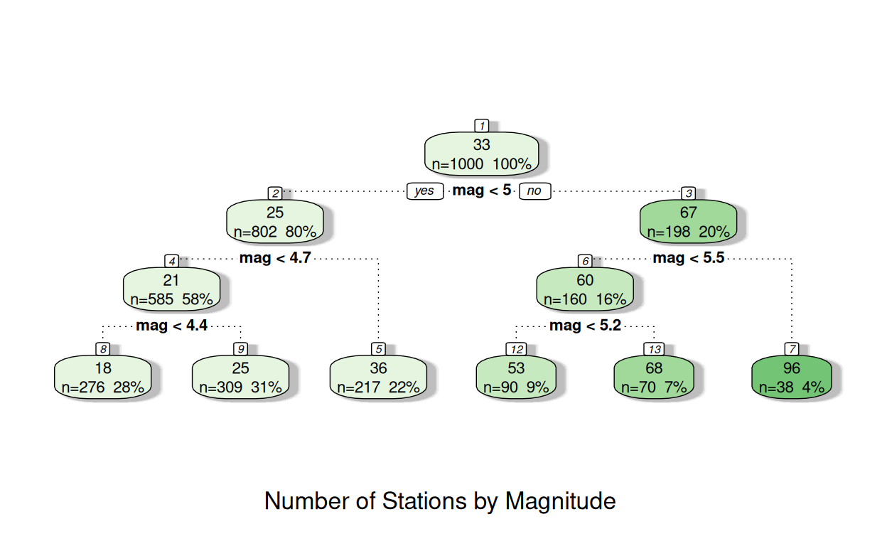
The numbers in each of the nodes show the average number of stations at the top, then the number of observations and the percentage of all of observations in the second line.
In node 1 the average number of stations is 33. This comes from all 1000 observations; 100% of the data.
The next line indicates the "best" split it can identify: those with a magnitude of less than 5 will go into "Node 2"; those with a magnitude more than 5 will go into "Node 3".
In node 2: the mean number of stations reporting was 25, with 80% of all earthquakes falling in this node. This compared to node 3 with the mean number of stations reporting was 67, with the remaining 20% of earthquakes
The tree continues in a similar way, until it reaches a "terminal node", where no further splits are made and the model predictions are based solely on this terminal node.
You can see in some instances in three above this may be reached after 2 splits, and sometimes after 3 - as the decision on whether an additional split is required is made for each node individually.
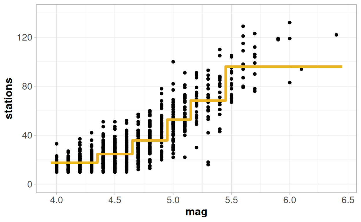
When dealing with a model that has a single continuous x variable this effectively creates a line that "jumps" to the mean value of each terminal node, depending on the cut-points defining that node:
To assess the quality of the model we can again, like the GLM, only really consider something comparable to other modelling techniques if we look at a metric based on the predictive quality of the model. And it is easy to do this again with an R-squared value from this model:
## [1] 0.756643At 75.7% this is more or less the same as what we saw from the logistic regression model, and is better than the Poisson or the linear regression models.
There are a lot of different machine learning methods out there, but a very large proportion of them which build up from this classification tree approach, and add increasing layers of complexity on to it.
In many ways the classification tree is the "general linear model" of the machine learning world - it is rarely the 'best' option in itself. But it is fairly easy to understand the output, and it is the easiest to implement requiring little computing power, and can give a useful starting part to build up from.
When dealing with many x variables it can also be an extremely powerful tool to identify subgroups with especially high or low values of y, made up of the combination of multiple different x variables that would be extremely difficult to identify by traditional statistical methods. And this approach is also identical regardless of whether y is a numeric or a binary or a categorical variable - it can be used to split the data to help explain the difference in the mean value of y, or based on the likelihood of the data falling into different groups defined by a y variable.
Model checking
As there are no parametric assumptions needed for this model to work, then there are no complicated residual plots or distributional quandaries to assess.
But there will always be one big question to assess regarding the model validity from using a machine learning approach. These methods are highly susceptible to 'over-fitting' - finding patterns in the data that cannot be generalised to the context outside the data. These issues become more likely with smaller datasets and with more variables.
Within the first 'tree' I set my model up to be relatively conservative, and only detect splits where there was a large difference in the results between the sub-groups. Partly because this helped to make the tree easy to see visually, as there were only a maximum of 3 layers, but also because this increases the robustness of the splits created.
But what if I had not done that and allowed the tree to identify as many splits as it possibly could?
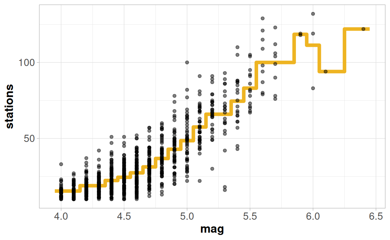
My predictions start out by looking excellent! Since I have quite a lot of earthquakes for each given magnitude, the tree has sufficient data to split off each unique value into it's own sub-group, and this pattern does form a fairly coherent consistent trend.
But then something has clearly gone off the rails at the higher values! The strange pattern the model proves does not look like a trend I would ever be able to justify theoretically. I have made predictions that "fit" my data extremely well: my R-squared value is now up to 78.7%! But this increase in the R-squared has actually come at the cost of making my model worse, rather than better. It will likely be of no use to help understand the general trends or make wider predictions.
Cross Validation
When using machine learning methods, it is always advisable to split your data at random in two before the start to try to prevent any issues like this. You would then build your model on the "training" set, usually around 80% of the data, and evaluate the quality of the model on a "test" set, usually 20% of the data.
If the model still appears to be making robust predictions on the "test" data, which are as good as those in the "training" data then the model is likely to be valid. If you see the quality of model fit in the "test" data is far below that in the "training" data, then the choices you made in the model fitting procedures are unlikely to be sensible. This should then lead to a tweaking of those choices to find a set of model which can be more robust to cross-validation.
In many ways this is a similar concept to the "Adjusted R-Squared" that exists within a general linear model framework.
So which is the best model then?
So, which is the "best" modelling approach of the ones we have considered?
That may depend on what our objectives are!
If we are interested in bringing in more variables, and understanding which of these variables are important to the overall relationship and how they all relate to each other, and test potential hypotheses around this relationship then we would certainly want to keep to one of the modelling approaches.
| Model | (Pseudo) R-Squared | Pros | Cons |
|---|---|---|---|
| Normal Linear Model | 72.5% | Simple! | Assumptions required for model validity look very dubious |
| Poisson General Linear Model | 75.2% | Matches the 'integer' class of the outcome variable | Incorrect shape of curve at higher values |
| Binomial Logistic General Linear Model | 75.7% | Fits an S-shaped curve, which matches the trends seen in EDA | Unknown number of stations requires us to make additional, almost certainly incorrect, assumptions about the data - the trends over time would lead us to assume that number of stations may not be constant |
| Regression Tree | 75.7% | Provides the highest R-squared value of any of the options | Non-parametric model means no assumptions; but also no parameters! So we can only use our model to make predictions, not to test hypotheses or to explore and understand variability |
The standard linear model is not a bad model at all, and has the advantages of being simple to update and understand. It only really loses its quality at the extreme end of the observed range.
The way in which the Poisson model exponentially increases would probably disqualify it from the running for me, despite the fact that stations is a "count" variable. It has attempted to rectify the problems of the linear regression model - and solved one of them, at the lower extreme, but at the cost of making one of them worse, at the higher extreme.
So if we want a model that most intuitively reflects the situation, then the logistic regression model is probably the better choice, despite the fact that we needed to invent an upper limit for number of stations. If I were to continue analysing this data, then I may be tempted to increase this approach and move to the estimation of an additional parameter for the upper limit, rather than inventing one.
But if our only objective was to be able to make predictions, rather than to explain the relationship, then we may go down the route of machine learning. And again the simple tree method is the "entry-level" to machine learning methods; so if I were to continue then I would probably consider additional methods beyond this which are likely to provide a more robust and higher quality set of prediction.
Mixed models - Fixed vs Random?
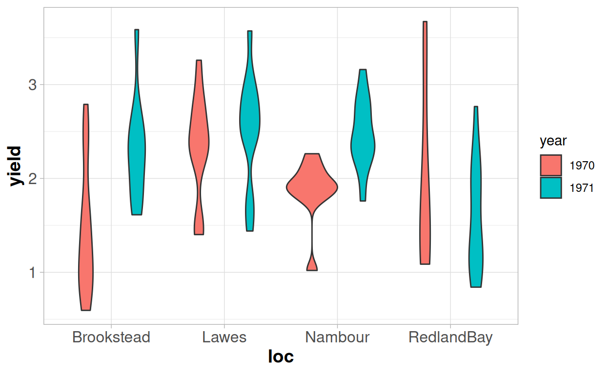
Let's look into a different avenue with one final set of examples to look at a different potential pathway for the way in which a general linear model may need to be extended. And we will revert back to a dataset we saw in the last module relating to soybeans in Australia.
We have 96 observations of either "Improved" or "Local" soybeans, that were taken from 4 different locations across 2 seasons.
Within each location+season combination we have between 8 and 14 different observations; depending on how many farms we were able to work with.
This time we will focus on the question of the yield, and specifically whether the local variety of soybean has a different yield on average to the improved variety.
We could just fit a simple linear model with one variable to assess this:
##
## Call:
## lm(formula = yield ~ variety, data = australia.soybean)
##
## Residuals:
##      Min       1Q   Median       3Q      Max
## -1.37223 -0.50538  0.03377  0.47887  1.35977
##
## Coefficients:
##              Estimate Std. Error t value Pr(>|t|)
## (Intercept)    2.3112     0.1259   18.36   <2e-16 ***
## varietyLocal  -0.3734     0.1518   -2.46   0.0157 *
## ---
## Signif. codes:  0 '***' 0.001 '**' 0.01 '*' 0.05 '.' 0.1 ' ' 1
##
## Residual standard error: 0.6894 on 94 degrees of freedom
## Multiple R-squared:  0.06048,    Adjusted R-squared:  0.05049
## F-statistic: 6.051 on 1 and 94 DF,  p-value: 0.01572
As there are only two unique levels for "variety", then this simple linear model is the same as a t-test, and we would conclude that there is some evidence to suggest that the two varieties have different yields, as the p-value is 0.016.
But we know that there are clear structural sources of variation that we are not accounting for - the location and the year - which cause our observations to violate the assumption of independence. We would expect the yields from the same location and the same year to be more similar to each other than to the results from other locations or years. We can see this in the data - some year/location combinations are higher yielding, and others are lower yielding.
We are then faced with a question, as we could deal with this in two different ways:
- Are we explicitly interested in the results from those 8 environments, and whether the results vary between those 8 environments?
- Or - are those 8 environments a "sample" from a wider possible set of environments?
This is the difference between what we consider to be "fixed" and "random" effects. The choice between the two is not always straightforward.
If we are interested in assessing these 8 environments specifically, we can continue with the linear modelling approach and include the location and year as additional variables within the model. An alternative name for this would be to consider them "fixed" effects. We can directly assess how the yield varies by location and year, and whether the locations and years are significantly different from each other; or if they had an interaction effect with the variety.
However this approach will then prevent us from using the model to generalise outside of this specific set of conditions. We could not use the model to make a prediction for a location we have not sampled from, or a year for which we do not have data.
##
## Call:
## lm(formula = yield ~ loc * year + variety, data = australia.soybean)
##
## Residuals:
##      Min       1Q   Median       3Q      Max
## -1.31070 -0.39259  0.03597  0.37298  1.51493
##
## Coefficients:
##                        Estimate Std. Error t value Pr(>|t|)
## (Intercept)              1.6458     0.1785   9.222 1.58e-14 ***
## locLawes                 0.9089     0.2216   4.102 9.19e-05 ***
## locNambour               0.4300     0.2428   1.771 0.080047 .
## locRedlandBay            0.5103     0.2428   2.102 0.038457 *
## year1971                 0.9331     0.2436   3.831 0.000241 ***
## varietyLocal            -0.3348     0.1330  -2.518 0.013634 *
## locLawes:year1971       -0.7371     0.3318  -2.221 0.028914 *
## locNambour:year1971     -0.3381     0.3499  -0.966 0.336579
## locRedlandBay:year1971  -1.1965     0.3467  -3.451 0.000863 ***
## ---
## Signif. codes:  0 '***' 0.001 '**' 0.01 '*' 0.05 '.' 0.1 ' ' 1
##
## Residual standard error: 0.5862 on 87 degrees of freedom
## Multiple R-squared:  0.3713, Adjusted R-squared:  0.3135
## F-statistic: 6.423 on 8 and 87 DF,  p-value: 1.538e-06
Notice how much of the variability is explained by the addition of location and year in the R-squared! Bringing in these variables has made the coefficient "varietyLocal" a little smaller than it was in the previous model - from -0.37 to -0.34. But the standard error and p-value are smaller in this model, despite the coefficient also being smaller. Because we have been able to explain more of the variability then we have increased the precision in our estimation of the effect of the variety; and we are more confident that it is having an effect on the yield.
But, even with just 8 'environments' we can see we need to fit a lot of different parameters to the model. And we may not really be that interested in most of these parameters - we care about the variety effect specifically, and only want to 'adjust' for the location differences. If we check the "adjusted r-squared" value, we can see this is somewhat lower than our "multiple r-squared" value, suggesting we may be in danger of an 'over-fitted' estimate.
So let's consider a "mixed" model instead. For this approach rather than creating 'fixed' parameters to capture the mean yields for each 'environment', we can create just one additional parameter. This additional parameter is a representation of the variance at the 'environment' level. So instead of one estimate for the residual variance we now have two - one at the "observation" level and one at the "environment" level.
## Linear mixed model fit by REML. t-tests use Satterthwaite's method [
## lmerModLmerTest]
## Formula: yield ~ variety + (1 | loc:year)
##    Data: australia.soybean
##
## REML criterion at convergence: 186.1
##
## Scaled residuals:
##      Min       1Q   Median       3Q      Max
## -2.11870 -0.77664  0.09025  0.60283  2.53486
##
## Random effects:
##  Groups   Name        Variance Std.Dev.
##  loc:year (Intercept) 0.1395   0.3735
##  Residual             0.3432   0.5858
## Number of obs: 96, groups:  loc:year, 8
##
## Fixed effects:
##              Estimate Std. Error      df t value Pr(>|t|)
## (Intercept)    2.2937     0.1712 13.5890  13.401 3.23e-09 ***
## varietyLocal  -0.3404     0.1322 88.8520  -2.575   0.0117 *
## ---
## Signif. codes:  0 '***' 0.001 '**' 0.01 '*' 0.05 '.' 0.1 ' ' 1
##
## Correlation of Fixed Effects:
##             (Intr)
## varietyLocl -0.530
The output splits out the random effect, for the location/year combination, from the fixed effects - which now just has one parameter for the variety.
Mixed models can sometimes be referred to as "multilevel" models - we split our variability into two levels: the "environment level", where we have 8 different environments, and the "farm level", where we have 96 different farms in total. The random effects table helps us to infer how much of the total variance is at the environment (loc:year) level and how much of the total variance is at the observation (residual level).
Roughly by looking at the ratio between the two you can see around 25% of the variability is at the environment level, and 75% at the observation level. If our observations were truly independent then we would expect to see 0% of variability being explained at the environment level.
The fixed effects section now resembles much more closely the initial linear regression model that we fitted; but both the parameter and the standard error are more similar to the second model that we fitted, which included location and year as fixed effects.
However it is not exactly the same: this is because not all location by year combinations have exactly the same number of observations. Mixed models are able to adjust for imbalance between the frequencies of levels of the random effects and treats all groups equally. The general linear model treat all observations equally, so those groups with larger sample sizes will have more of an impact on the model. There may be reasons why either approach here could be preferred, depending on how the data was collected and what the objectives are for the analysis - but with both models this estimation process could be altered by the potential applications of weights.
If we wanted to create a model which allowed us to make inferences beyond these 8 environments then we could now do so, although at the moment it would be a bit limiting. We know there are differences between the environments, but we would achieve the same prediction every time as there is just one parameter in the fixed part of the model. But if we then had variables available which helped us to characterise those environments - altitude, climate, soil quality and so on - we could add these variables into the 'fixed' part of our model, and be able to provide predictions for a new environment whilst still adjusting for the lack of independence in the original dataset. This is something we could not do with a linear model.
And where the power of mixed models really comes in is when dealing with more complex structural dependencies - such as hierachical data - where you may have different variables measured at different levels. For example in this example we have assumed that the farms are different in the two seasons - but it may be the case that we have the same farm measured over multiple seasons. And some data about the farm may be the same each year, but other data may vary by year. And then there may be data available on climatic conditions at "location" level but not at farm level. So variables may exist at three different "levels" - to be able to account for this we need to have a mixed model which allows this structure to be modelled for.
Understanding in full how these mixed models work, requires a little more time and practice. You can find more resources about mixed models here: https://m-clark.github.io/mixed-models-with-R/
Exercises
For these exercises we are going to think the same soybean data in a slightly different way, and mostly focus on some examples of logistic regression
Our objective is going to be to look at the observable characteristics: the height, protein, oil content of the soy beans and see if we are able to determine whether they are a "Local" or an "Improved" variety of soybean.
This would be a "classification" problem rather than a 'regression' problem - but we can still apply the exact same logic of fitting a model to predict which of the two varieties the soybean is. And because there are exactly two varieties this is an example of a binary variable, and we can use the same approach of fitting a logistic generalised linear model.
You can download the data used here:
Download DataQuestion 1
Use the tool below to explore the relationship between the height, protein, oil, and environment with the improved varieties. Our outcome variable here is p - the percentages of soybeans that are "improved" (p). The percentage of soybeans that are "local" can be considered as 1-p.
In order to assess how the binary outcome (% improved), varies by continuous outcomes (height, protein, oil) the continuous variable has been categorised broken into equally sized groups - each containing 10% of the observations - so that we can see how the percentage varies as the predictor variable increases.
Which, if any, of the variables look to be associated with whether a variety is "improved"? And how?
Do the relationships between the variables and the outcome look plausible as a 'linear trend' when you consider the relationship on the log odds scale?
Which, if any, of the variables do not look to be associated with whether a variety is "improved"?
Question 2
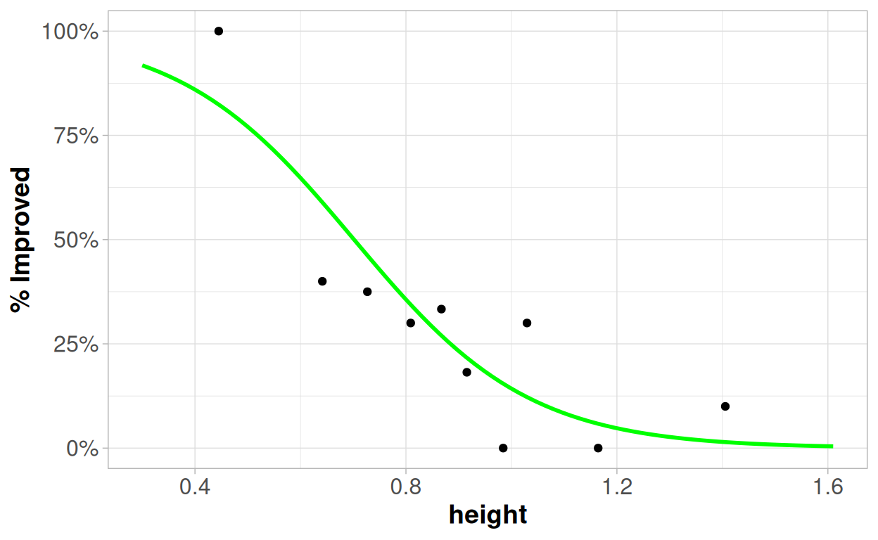
From the exploration in question 1 then hopefully you may have identified that height seemed to have the most consistent looking relationships with the probability of a variety being improved. As height increases the likelihood of the soybean being an improved variety decreases; as oil increases the likelihood of the soybean being an improved variety increases.
Let's start by looking at a model just of height using the logistic regression model:
##
## Call:
## glm(formula = variety == "Improved" ~ height, family = "binomial",
##     data = australia.soybean)
##
## Coefficients:
##             Estimate Std. Error z value Pr(>|z|)
## (Intercept)    4.218      1.154   3.656 0.000256 ***
## height        -6.012      1.406  -4.277 1.89e-05 ***
## ---
## Signif. codes:  0 '***' 0.001 '**' 0.01 '*' 0.05 '.' 0.1 ' ' 1
##
## (Dispersion parameter for binomial family taken to be 1)
##
##     Null deviance: 119.249  on 95  degrees of freedom
## Residual deviance:  89.561  on 94  degrees of freedom
## AIC: 93.561
##
## Number of Fisher Scoring iterations: 5
What does this model tell you about the relationship between the height and the likelihood of a variety being improved?
Try to interpret as many of the numbers as you can! Remember that the logistic regression model works on the "log odds scale", so our general formula is: log(p/(1-p)) = β0 + β1x
You can see how the model relates to the data here:
Question 3
And now let's consider what happens if we add in oil
##
## Call:
## glm(formula = variety == "Improved" ~ oil + height, family = "binomial",
##     data = australia.soybean)
##
## Coefficients:
##             Estimate Std. Error z value Pr(>|z|)
## (Intercept)  -8.7126     4.0107  -2.172  0.02983 *
## oil           0.5081     0.1620   3.137  0.00171 **
## height       -2.8871     1.4114  -2.046  0.04080 *
## ---
## Signif. codes:  0 '***' 0.001 '**' 0.01 '*' 0.05 '.' 0.1 ' ' 1
##
## (Dispersion parameter for binomial family taken to be 1)
##
##     Null deviance: 119.249  on 95  degrees of freedom
## Residual deviance:  77.657  on 93  degrees of freedom
## AIC: 83.657
##
## Number of Fisher Scoring iterations: 5
Again - try to interpret as many of these numbers as you can, and consider the different interpretations of the parameters compared to the model in question 2.
What would be the likelihood of an improved variety if I observed a soy bean plant with a height of 0.4m and an oil content of 24? How would this change if the height was 1.4m and the oil content was 24?
The table below shows us some goodness-of-fit statistics - looking at the "Pseudo-R Squared" values and the AIC values. The AIC is a metric which allows for comparison of models fitted on the same dataset, using the same "family". It is a relatively simple metric to interpret - the lower the AIC value the "better" the model is. You can read more about this here:
| Model | Pseudo.R.Squared | AIC |
|---|---|---|
| Height only | 0.255 | 93.561 |
| Oil only | 0.327 | 86.915 |
| Height + Oil | 0.386 | 83.657 |
Question 4
Let's go back to looking at single variable - this time protein:
##
## Call:
## glm(formula = variety == "Improved" ~ protein, family = "binomial",
##     data = australia.soybean)
##
## Coefficients:
##             Estimate Std. Error z value Pr(>|z|)
## (Intercept)  9.29978    3.57654   2.600  0.00932 **
## protein     -0.25278    0.09018  -2.803  0.00506 **
## ---
## Signif. codes:  0 '***' 0.001 '**' 0.01 '*' 0.05 '.' 0.1 ' ' 1
##
## (Dispersion parameter for binomial family taken to be 1)
##
##     Null deviance: 119.25  on 95  degrees of freedom
## Residual deviance: 109.89  on 94  degrees of freedom
## AIC: 113.89
##
## Number of Fisher Scoring iterations: 4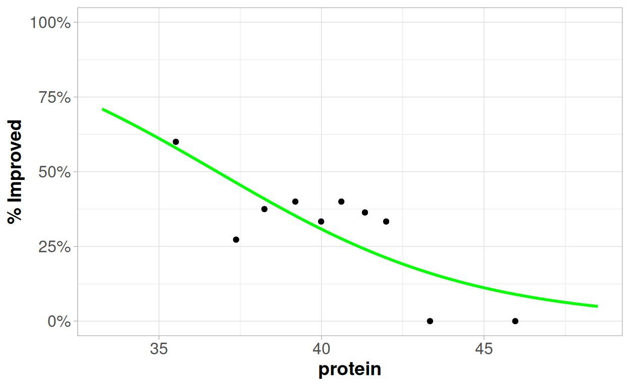
What do we think about this relationship? Has it been well captured by the model? What steps could we take to improve the model?
Question 5
With all of our variables we saw that, to varying degrees, the assumption of a linear relationship between the variable and link function of the logistic regression was somewhat questionable. And we saw some extremely strong looking predictive power, that could be found from looking at the extreme values - all of the soybeans with a low height were improved varieties; all of the soybeans with a high protein content were local varieties; and all of the soybeans wth a high oil content were improved varieties.
In addition to this our main objective here is to make predictions - so we may be tempted to go through a machine learning approach.
The following tree is based on using 80% of the data available, 76 rows:
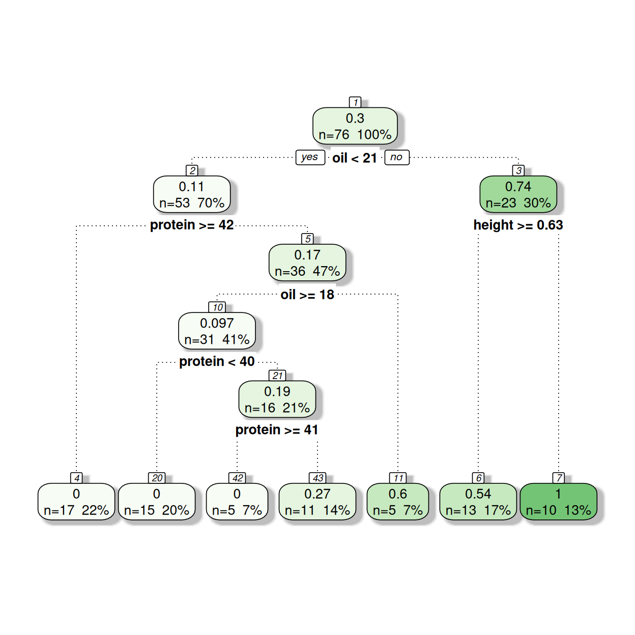
See if you can interpret how this model works from the output - the top number represents the proportion of the soybeans which are improved, then the bottom row contains the number of observations within the node and the percentage of observations within the node.
The table below shows the pseudo-r squared values from assessing the model predictions against the data on which the model was built (the training data), and then also from assessing the model predictions against the 20% of observations that were not used in the model creation.
How would we interpret these numbers in relation to the goodness-of-fit of the model, and the potential for over-fitting? How might this compare to what we were able to achieve through the logistic regression model?
| Data | Pseudo R-Squared Value |
|---|---|
| Training Data - n=76 | 0.5877304 |
| Test Data - n=20 | 0.5544920 |
References
Analysing Data using Linear Models: https://bookdown.org/pingapang9/linear_models_bookdown/
Mixed Models with R: https://m-clark.github.io/mixed-models-with-R/
Statistical rethinking with brms, ggplot2, and the tidyverse: Second edition: https://bookdown.org/content/4857/
Modern Data Science with R: https://mdsr-book.github.io/mdsr2e/ch-modeling.html